I stayed at one of the properties before I designed the brand.
The first thing I noticed was the details. Linen on the bed pressed and tucked. A handwritten note on the kitchen counter. Local coffee on the counter. The kind of small choices most rentals skip — the ones that quietly tell you someone cared.
That experience became the brief.
Majestic Stays — formerly Majestic Lodge — had grown from a single property into a portfolio. Each home had its own personality. What was missing was the system that tied them together. A brand that could scale across properties without losing the personal touch that made the original feel special.
What turns a vacation rental into something memorable?
The real challenge wasn't aesthetic. It was structural. The brand needed to hold many personalities under one roof.
I sat down with Melissa and Jayden and asked the only question that mattered.
Why did this all start?
Their answer was simple. "Stay here. We wanna treat you like family."
That one line became the anchor. Everything I designed had to deliver on it — the logo, the color, the type, the way the welcome sign greeted you at the door. Luxury, yes. But warm. Specific. The kind of place that remembers your name.
The strategy held one tension at its center. Elegance and warmth, in equal weight.
Three creative pillars sat underneath every decision:
One brand, many homes. Each property feels distinct — but you can always tell they belong to the same family.
Detail as design language. The brand should feel as considered as the homes themselves.
Symbolism that holds weight. Every visual element earns its place.
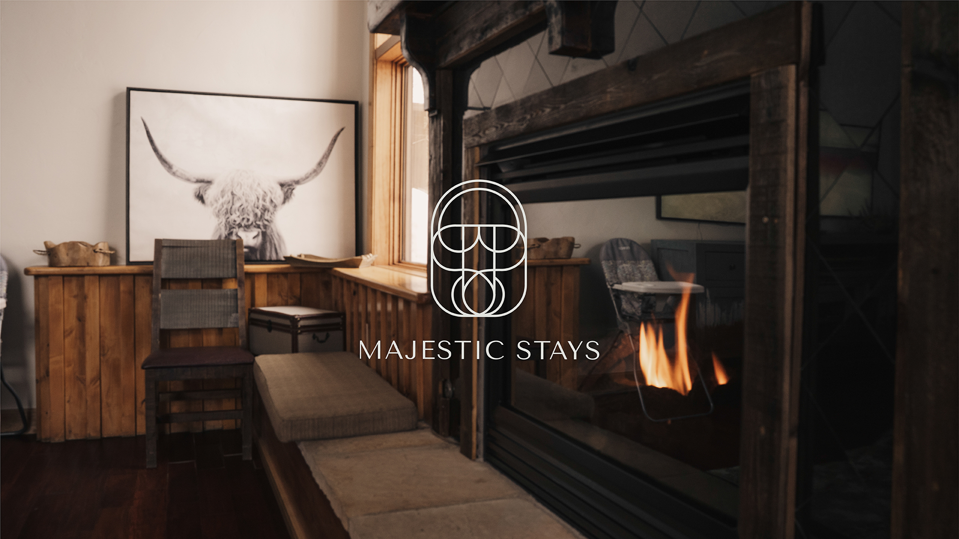
The unlock was the lock-and-key motif. Intimacy and exclusivity in one mark. Universal enough to scale across properties. Personal enough to feel like an invitation.
A primary lock-and-key mark paired with secondary marks for each property. One framework, infinite expressions.
A neutral master palette — refined, restrained, hospitable. Each property earns its own signature color woven into the larger system. Villa Color Rosa runs deep blush. Happy Hour borrows from sunset. The Lodge stays grounded in earth tones.
A timeless serif paired with a modern sans-serif. Luxury that feels contemporary, not dated.
Linen, marble, soft brushstrokes — visual reminders of the tactile experience of being inside a Majestic Stays property.
The system extends across every guest touchpoint — the welcome sign at the door, the candle on the dresser, the mug in the kitchen, the do-not-disturb hanger, the wine on the counter. Each detail was an opportunity to deliver on the promise.
The website carries the same restraint and warmth — cinematic photography, generous spacing, type that holds the room.
A scalable brand system the founder can grow with. Every future property has a place in it from day one.
Each villa now feels distinct without competing with its siblings. The lock-and-key motif gave the brand a memorable hook that travels across signage, packaging, and digital. The founder walked away with a versatile toolkit — ready for whatever property comes next.