There are basically two kinds of martial arts schools.
The first one is the belt factory. Kid-focused, gimmicky, treats the dojo like daycare with kicking. The second is the traditional school — sterile, intimidating, mostly rules and not much warmth.
Neither is what most people actually want.
Inseng's founder had been coaching for over 15 years and could see the gap clearly. He wasn't trying to open another school. He was trying to open the third path — somewhere a kid could start, an adult could come back to themselves, and a serious athlete could chase real competition. All under one roof.
That's a brand challenge. Not just a logo.
How do we look welcoming to a first-timer and credible to a competitive athlete?
How do we differentiate from the "belt factory" without losing the warmth that makes families show up?
How do we say accountability, courage, tough as shit without losing play, community, and joy?
The brand had to hold all of that at once. Tough love with a smile.
I started where every good brand should — sitting across from the founder.
What I heard was bigger than a business plan. He'd been carrying this idea for 15 years. He wanted people to achieve more than they believed possible — whether they were starting Taekwondo for the first time or chasing a podium. The brand had to deliver on that, not just describe it.
I took the rest of it apart from there:
The insight underneath all of it: people aren't actually looking for a school. They're looking for real coaching, real connection, real challenge. Give them a brand that promises grit with guidance and they'll show up.
The positioning came out clean. Modern Taekwondo for real growth — beginner to elite — powered by coaching, community, and competition.
The voice followed the founder's actual cadence. Direct. Encouraging. Honest. Coach energy — clear standards plus high-fives.
Three pillars sat under every decision:
Grit over comfort. Hard things, structured well. The brand should never apologize for the bar being high.
Team over ego. Community, legacy, pass-it-forward culture. Nobody wins alone.
Process over outcome. Habits, accountability, daily excellence. Wins are downstream of practice.
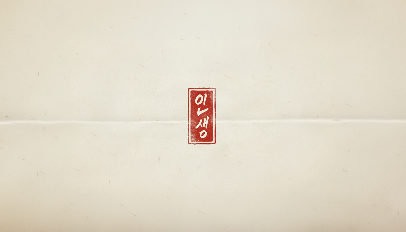
The design language followed. Street meets tradition — brushstroke energy alongside disciplined geometry. Sparring colors, used purposefully. No pastels.
Strong geometry for structure and trust. The kind of mark that holds up on a championship banner and a school newsletter.
A dynamic interplay of red and blue — the official colors of competitive sparring. Movement without cliché. The mark reads as energy, not symbol.
A neutral, minimal base — air and light for the gym. Red and blue as accents, used with restraint. The kind of palette that lets the people inside the brand carry the energy.
A clean modern sans for clarity and standards. A hand-inspired secondary face for motion, culture, and edge — graffiti and calligraphy nodding to each other.
Angle cuts and speed lines suggesting combinations and footwork. Motion built into the visual system itself.
The system extended into a launch kit — Pearl Street flyers for foot traffic, open house signage, social templates for class announcements and coach tips, uniform accents and team apparel that members would actually want to wear off the mat.
Pre-launch signals were clear:
The brand pulled cleanly away from "belt factory" associations and read as a real coaching brand from the first impression. Messaging tested well with parents looking for character plus competition — grit, standards, community. The street-team collateral was built specifically to drive foot traffic to the open house and convert curious passers-by into sign-ups.
"Tough, welcoming, and legit. This is the brand we wished existed when we started."